Menu

EpiDocs
An HR application for precision-targeting and deployment of emergency response personnel.
*Only select screens are shown to respect NDA limitations.


As a scientific emergency response organization, The Public Health Agency has tremendous capacity and potential to protect the health of people in Canada.
To do this effectively, we need to quickly and efficiently mobilize our people and access highly specialized expertise.
Methods & Tools
Co-design Workshop, Figma, User testing
Role
Lead Product Designer
Duration
Ongoing
Current HR systems inadequately map and analyze employee skills and competencies, resulting in knowledge gaps and inefficient resource allocation within the organization.
Outdated Search Page
Fragmented Layout
Poor Information Hierarchy
Lack of Visual Data Representation
Manual & Tedious Interaction
Previous HR platform search page
Busy Results Page
Overwhelming Density
Poor Use of Space
Lack of Visual Hierarchy
Outdated Aesthetic
Previous HR platform results page
Initiating our sprint, I introduced journey mapping to the team. This technique illuminated user pain-points and platform inefficiencies, while impressing the team and guiding our user-focused improvement strategies.
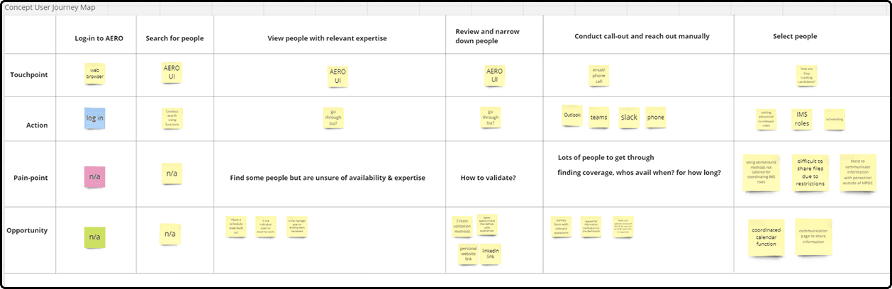
Journey map built in Miro during workshop session
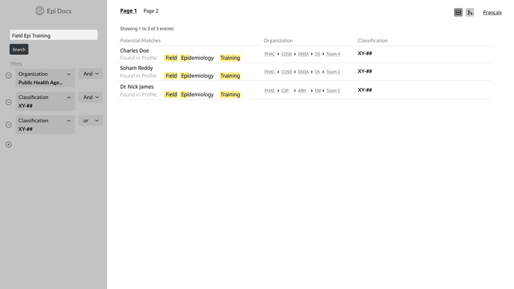
Users wanted additional information on employees skills, team affiliations, deployment status, and availability.
Exploring a new interface that incorporates key desired features such as a visual organization chart and skill mapping

Sketch 1: Organizational chart
Exploring a new advanced search page with improved organization and layout
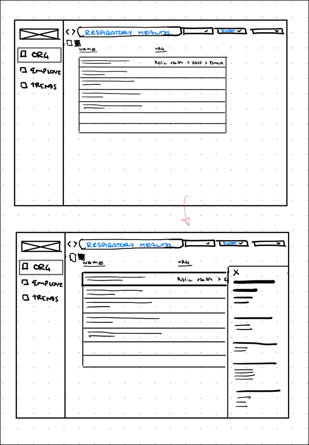
Sketch 2: Search results
*Only select screens are shown to respect NDA limitations.
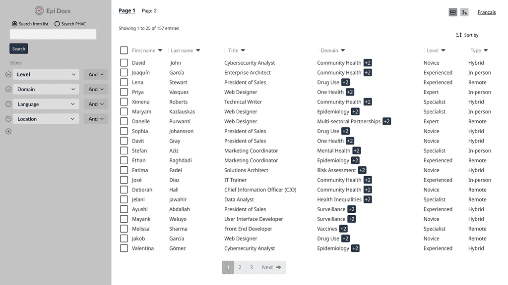
Updated UI
New workflow for searching and identifying personnel
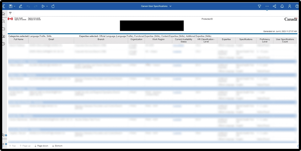
Additional employee information
Availability status
Training and affiliated projects
Skills map
During user testing, we found that past applications introduced similar features, but they failed due to employees not updating their profiles and users being uncertain about the profile's recency
The underlying problem was that users rarely updated their profiles, resulting in outdated information and eventual abandonment of the program due to irrelevance.
We designed our new UI with gamification elements to incentivize regular updates, and added a feature allowing administrators to prompt users with outdated profiles without leaving the system
*Only select screens are shown to respect NDA limitations.
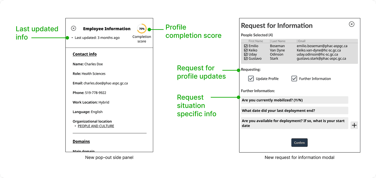
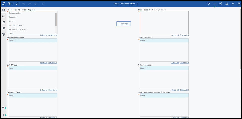
New features: Profile completion score and request for additional information
Users immediately recognized the benefits of the updated features, enhancing their workflow and saving them manual effort and time. This impact led to significant buy-in from VPs. The application is now in further development.
*Only select screens are shown to respect NDA limitations.
As the lead UX designer in this sprint, I realized the vital role designers have in project management and defining a project direction. By guiding the team towards user testing early on and shaping our development strategy, I ensured we understood user needs which allowed us to uncover the root causes.